|
Editing and Creating the Advanced List Box Style |
  
|
Editing and Creating the Advanced List Box Style
|
Editing and Creating the Advanced List Box Style |
|
Overview
The following presents the options available (A, B and C) to create/edit an Advanced List Box control's style.
Option A
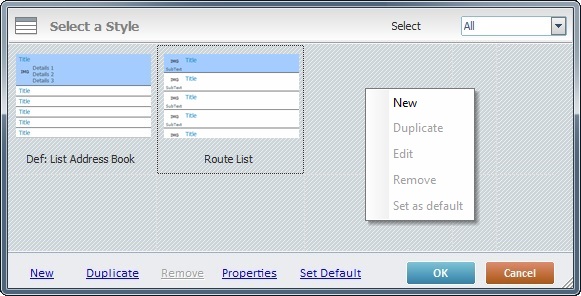
Click the “Change Style” option located in the control's right-click menu (see Editing and Creating Styles). The resulting window displays the following options:
Details of the "Select a Style" window
|
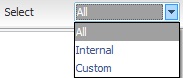
It is possible to filter the displayed styles. Select one of the following options from the drop-down list: All – Displays all the styles available. Internal – Displays MCL-Designer V4's standard styles. Custom – Displays the styles you have created. |
|
Opens a “Style Properties” window to create a new style. |
|
Duplicates the selected style. It also enables the edition of the duplicated style in the “Style Properties” window. |
|
Only removes a style that you have created (custom style). |
|
Opens a “Style Properties” window, but only the styles you have created can be modified/edited. |
|
Sets the selected style as the default style ("Def:" is added to the style's designation). Once set, the default style will be adopted by all Advanced List Box controls dragged from the “Control” tab onto the screen. |
Some of these options can also be accessed by right-clicking any style in the "Select a Style" window and opening a menu as shown below:
|
|
Right-click a style |
Right-click a blank space in the "Select a Style" window |
|
Opens a “Style Properties” window to create a new style. |
Duplicates the selected style and enables its edition in the “Style Properties” window. |
|
Opens a “Style Properties” window to display the selected style’s properties. Only the styles you have created can be modified/edited. |
|
Only becomes active if you select a custom style. It deletes styles that you have created. |
|
Defines the selected style as the default style for any Advanced List Box controls that are dragged from the “Control” tab onto the screen. |
Option B
Right-click the Style Preview section (located below the “Control” tab). This opens a menu list with the following options:
|
New |
Opens the “Style Properties” window to create a new style. |
Duplicate |
Duplicates the selected style and enables its edition in the “Style Properties” window. |
|
Properties |
Opens a “Style Properties” window to display the selected style’s properties. |
|
Remove |
Option only available if you select a custom style (standard styles cannot be removed). |
|
Set as default |
Defines the selected style as the default style for any Advanced List Box controls that are dragged from the “Control” tab onto the screen. |
Whichever the option used (A or B), the creation of a new style occurs in the "Style Properties" window. Take the following steps to fill in/adjust the available options in this window:
1. Open the "Style Properties" window.
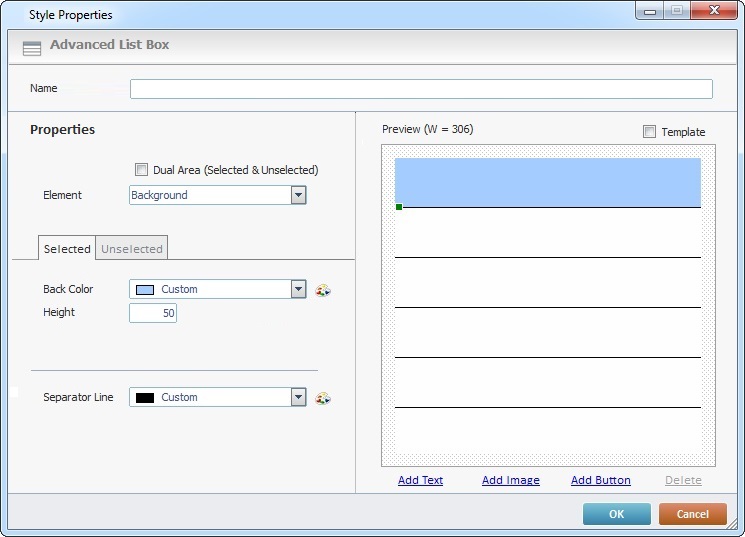
2. Enter a name for the new style in the "Style Name" box.
3. Select the element you want to edit.
 At this point, the "Element" drop-down only contains the default "Background" option but it is possible to add text, images and buttons to the control. Once a text/image/button element is added, it becomes available in the "Element" option's drop-down.
4. Check "Dual Area (Selected & UnSelected)" to allow you to edit the selected and unselected states of the existing elements (background, text, image, and or button elements). If left unchecked, you will only view/edit options regarding an element's selected state.
In the case of the "Background" element, it also enables the "Height" and "Same as Selected" options of the "Unselected" tab.
5. In the "Selected" tab (open by default), select a background color for the selected area from the drop-down OR click  and customize a color in the resulting window.
6. In the "Height" option, define the selected area's height.
7. Select a color for the separator line from the drop-down OR click and customize a color in the resulting window.
8. In the "Unselected" tab, select a background color for the unselected area from the drop-down OR click and customize a color in the resulting window.
If "Dual Area (Select & UnSelected)" is checked, the "Height" and "Same as Selected" options are active.
9. Define the unselected area's height.
10. If you want to have the same height for the background's selected and unselected areas, check "Same as Selected". This means the previously entered height value for the unselected area is ignored.
11. Select a color for the separator line from the drop-down OR click and customize a color in the resulting window.
The preview box, to the right, displays the changes you enter.
12. If required, add a "Text" element. Click  .
.
If you want to add an image element instead, continue to step 24.
If you want to add a button, go to step 34.
If you are done with the Advanced List Box editing, proceed to step 49.
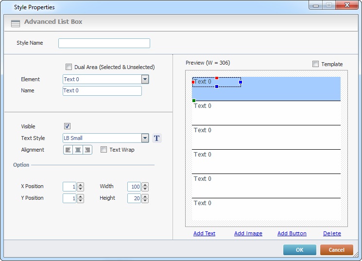
When you click for the first time, the preview box automatically displays a "Text 0" area in all the rows. If you click again, you add another text element on top of the existing text element with an incremented number (in this case, a "Text 1", then, a "Text 2" and so on).
13. Enter a name for the new text element, in the "Name" field. The new name is displayed in the preview box and in the "Element" drop-down list (it replaces the "Text x" designation).
If you have selected the "Dual Area (Select & UnSelected)" option, in the "Background" element (step 4), you will access two tabs (Selected/Unselected). If the option was left unchecked, you will only access the "Selected" tab's options.
14. In the "Selected" tab, open by default, check the "Visible" option. This ensures the text element's visibility when it is selected.
15. Select a text style from the drop-down.
As an alternative, you can click  to open a "Select a Style" window.
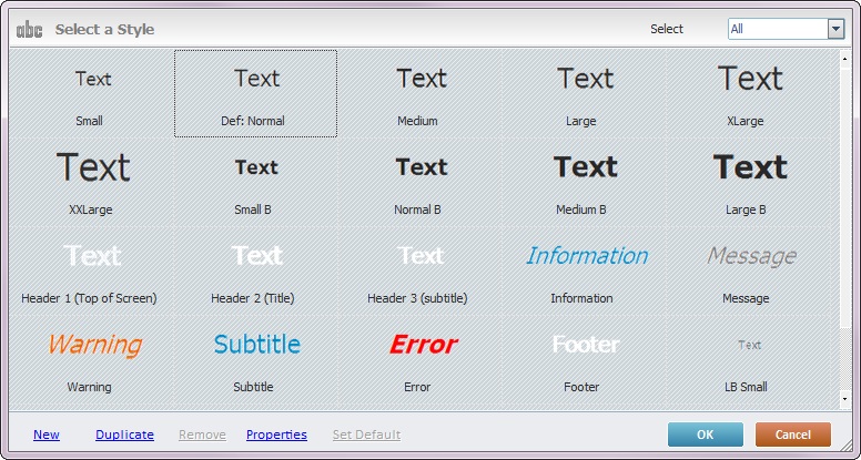
a. Select the appropriate text style.
b. Click  to apply and return to the "Style Properties".
This "Select a Style" window is the same as the "Select a Style" window of a Display Text control. If you want to add/edit text styles, see Editing and Creating the Display Text Style.
16. Define the text element's alignment (left, center or right) and check the "Text Wrap" option, if needed.
A text element 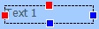 is a dynamic object. It can be dragged (click and drag it) or stretched (use the red/blue points to click and stretch).
17. In "Option", specify the text element's position (X, Y coordinates) and size (Width and Height).
18. If available, open the "Unselected" tab.

19. Check the "Visible" option to ensure the text element's visibility when it is not selected.
20. Select a text style from the drop-down OR click and select an available style in the resulting window. (If you want to add/edit text styles, see Editing and Creating the Display Text Style.)
21. Use the alignment buttons to position the text element (Left, Center or Right) and check the "Text Wrap" option, if needed.
22. In the "Option" section, enter position (X, Y coordinates) and size (Width and Height) values to specify the text element's position.
23. If you want to have the same position values (X, Y, Width and Height) for both selected and unselected states of the text element, check "Same as Selected". This means the previously entered position values for the unselected state are ignored.
The preview box, to the right, displays the changes you enter.
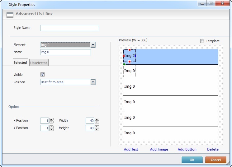
24. If required, add an image to the control. Click  .
.
If you want to add a button, go to step 34
If you are done with the Advanced List Box editing, proceed to step 49.
 4
4
When you click for the first time, the preview box automatically displays an "Img 0" area in all the rows. If you click again, you add another image element on top of the existing image element with an incremented number (in this case, an "Img 1", then, an "Img 2" and so on).
25. Enter a name for the added image element in the "Name" field. The new name is displayed in the preview box and in the "Element" drop-down (it replaces the "Img x" designation).
If you have selected the "Dual Area (Select & UnSelected)" option, in the "Background" element (step 4), you will access two tabs (Selected/Unselected). If the option was left unchecked, you will only access the "Selected" tab's options.
26. In the "Selected" tab, open by default, check the "Visible" option. This ensures the image element's visibility when it is selected.
27. Select the appropriate position for the image element from the drop-down ("Best fit to area" (Default), "Center", "True Size", "Stretch" and "Tile").
28. In "Option", specify the element's position (X, Y coordinates) and size (Width and Height).
29. If available, open the "Unselected" tab.
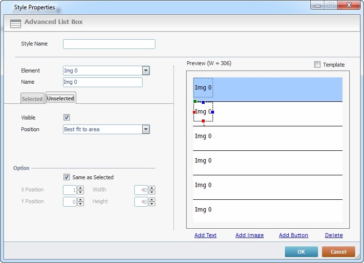
30. Check the "Visible" option, if the image element is to be visible when the line is not selected.
31. Define the appropriate position for the image element from the drop-down ("Best fit to area" (Default), "Center", "True Size", "Stretch" and "Tile").
The image element  is dynamic. It can be dragged (click and drag it) or stretched (use the red/blue dots).
32. In "Option", you can specify the element's position (X, Y coordinates) and size (Width and Height).
33. If you want to have the same position values (X, Y, Width and Height) for both selected and unselected states of the image element, check "Same as Selected". This means the previously entered position values for the unselected state are ignored.
The preview box, to the right, displays the changes you enter.
34. If required, add a button to the control. Click  .
.
If you are done with the Advanced List Box editing, proceed to step 49.
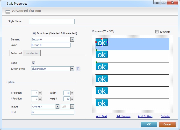
When you click for the first time, the preview box automatically displays an "OK" area in all the rows. If you click again, you add another button element on top of the existing button element. To view it, select and drag it to another position.
35. Enter a name for the added button element in the "Name" field. The new name is displayed in the "Element" drop-down list (it replaces the "Button x" designation).
If you have selected the "Dual Area (Select & UnSelected)" option, in the "Background" element (step 4), you will access two tabs (Selected/Unselected). If the option was left unchecked, you will only access the "Selected" tab's options.
36. In the "Selected" tab, open by default, check the "Visible" option. This ensures the button element's visibility when it is selected.
37. Select the appropriate style for the button element from the drop-down OR click and select an available style in the resulting window.
This "Select a Style" window is the same as the "Select a Style" window of a Button control. If you want to add/edit button styles, see Editing and Creating the Button Style.
38. If required, insert an image in the button element. Select an image from the drop-down (the options available are the image resources included in the "Resources" module). If no image is needed, select "<None>".
39. If you select an image, you activate the next option regarding the positioning of that image. Select the appropriate position (Left, Right, Top or Bottom).
40. Enter the text you want displayed in the button in the "Text" box.
41. In "Option", specify the element's position (X, Y coordinates) and size (Width and Height).
42. If available, open the "Unselected" tab.
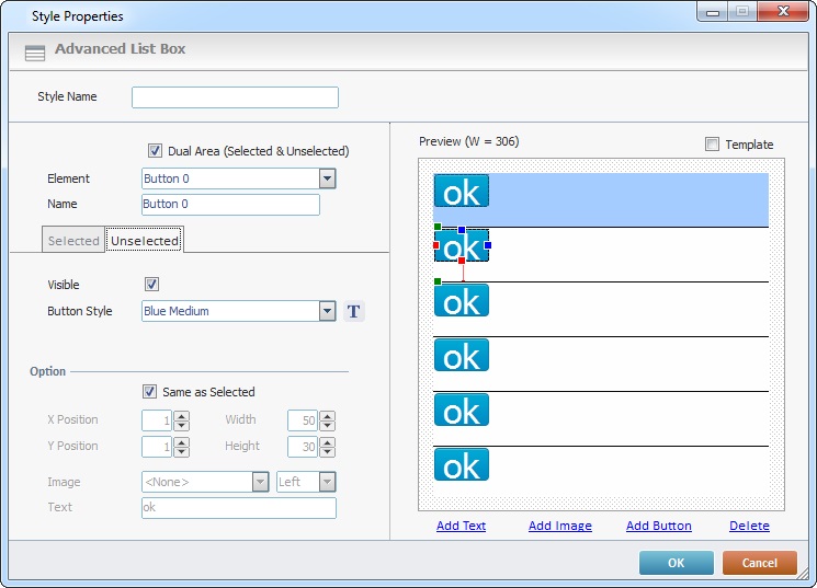
43. Check the "Visible" option, if the button element is to be visible when it is not selected.
44. Select the appropriate style for the button element, in its unselected state, from the drop-down OR click and select an available style in the resulting window. (If you want to add/edit button styles, see Editing and Creating the Button Style.)
45. If required, insert an image in the button element, for its unselected state. Select an image from the drop-down (the options available are the image resources included in the "Resources" module). If no image is needed, select "<None>".
46. Enter the text you want displayed in the button, when unselected, in the "Text" box.
47. In "Option", enter values to specify the element's position, when unselected (X, Y coordinates) and size (Width and Height).
48. If you want to have the same position values (X, Y, Width and Height) for both the selected and unselected button states, check "Same as Selected". This means the previously entered position values for the unselected button element are ignored.
The preview box, to the right, displays the changes you enter.
Use the preview box to view but, also, to select the element(s) you want to edit.
You can change the position/dimension of the selected element(s).
You can delete the selected element(s) by clicking  .
.
Select an element and the corresponding tab opens.
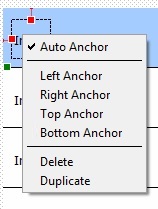
Since the Advanced List Box allows you to add multiple elements within a field, and these elements can be displaced during a device screen rotation, you can use anchors to keep each element in place within its field. Right-click the element you want to pin down so you can access the following menu:
|
Auto Anchor |
This option is checked by default. This means that, depending on the element's position within the field, it will automatically be anchored to the nearest position. Ex: A newly added element is usually placed on the field's upper left corner (X/Y position 1). If "Auto Anchor" is checked, it will anchor the element to the field's top and left sides which are the nearest. |
Left Anchor |
Check this option if you want to anchor the selected element to the field's left side. Make sure to uncheck the "Auto Anchor" option first. |
|
Right Anchor |
Check this option if you want to anchor the selected element to the field's right side. Make sure to uncheck the "Auto Anchor" option first. |
|
Top Anchor |
Check this option if you want to anchor the selected element to the field's top side. Make sure to uncheck the "Auto Anchor" option first. |
|
Bottom Anchor |
Check this option if you want to anchor the selected element to the field's bottom side. Make sure to uncheck the "Auto Anchor" option first. |
|
Delete |
Use this option to delete the selected element. |
|
Duplicate |
Use this option to duplicate the selected element. |
A red dot in the selected element represents an anchor.
Anchor Example
The Text element "Price" has a "Right Anchor" and a "Top Anchor" (identified by the red lines and dots).
Regardless of the context (MCL-Designer V4, MCL-Simulator/MCL-Client), the "Price" Text element will always be positioned to the field's top right corner:
•control resizing within MCL-Designer,
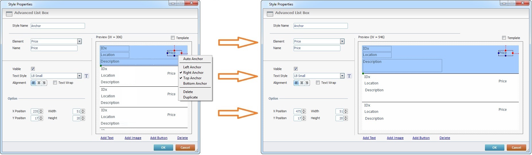
•Screen rotation (ex: portrait to landscape orientation) within MCL-Simulator or the target device.
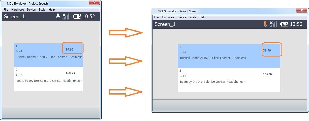
If you anticipate a lot of screen rotations with the target device and want to ensure that the elements maintain the intended position within the each field, we recommend you uncheck the "Auto Anchor" and check the appropriate anchors manually.
49. Click to apply all your changes.
When checked, the "Template"option (upper right corner) enables a quick preview of the created control with values.
Option C
Option C can only be used to transform controls that have already been dragged onto the screen:
•Select the appropriate style displayed in the Style Preview section (below the "Control" tab) and drag it onto the control you want to modify. The control will automatically adopt the new style.
Keep in mind that the styles displayed in the Style Preview section - standard styles - cannot be edited/deleted, their features are locked in (the  is displayed on the upper right corner of the "Style Properties" window).