|
Splash Screen |
  
|
Splash Screen
|
Splash Screen |
|
Overview
The "Splash Screen" tab provides information on the image that is displayed after the device's application icon is clicked (and before it is launched).
The displayed information is editable and you can view your changes in the preview box.
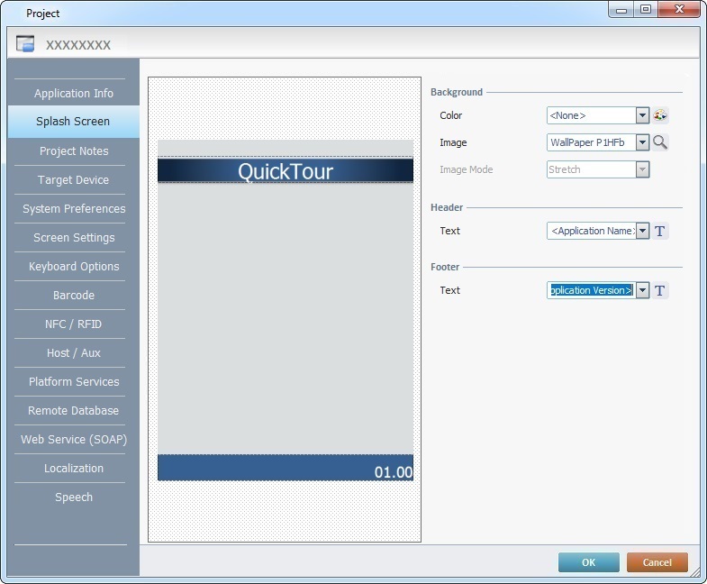
Define the "Background" settings:
Background |
|
Color |
Select the background color for the "Splash Screen". Select it from the drop-down OR click |
Image |
Define the image to be used in the "Splash Screen". Either select an available wallpaper from the drop-down list OR click |
Image Mode |
If you select one of the available wallpapers, the "Image Mode" option will NOT be active. If you select an image (by browsing your PC), you can define how that image will be displayed. Select the best "Image Mode" from the corresponding drop-down: "True Size" The image is viewed in its true size. Make sure the size of the selected image does not exceed the splash screen area. "Center" The image is centered within the splash screen area. "Best Fit to Area" The image is made to fit the splash screen area. "Stretch" The image is stretched within the splash screen area. "Tile" The image is displayed in a tile format within the splash screen area. |
Define the "Header" and "Footer" in the corresponding sections:
Header |
|
Text |
Define what will be displayed in the header. You can add custom text or use one of the following project variables - "<Application Name>, <Application Version>, <Author>, <Company>, <Contact>") - select the intended option from the drop-down list. If you want to add or edit the displayed information, select the intended text type and enter your text directly into the box. If required, use |
Footer |
|
Text |
Define what will be displayed in the footer. You can add custom text or use one of the following project variables - "<Application Name>, <Application Version>, <Author>, <Company>, <Contact>") - select the intended option from the drop-down list. If you want to add or edit the displayed information, select the intended text type and enter your text directly into the box. If required, use |
Detail of the "Font Style" window
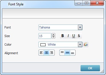
Font Style |
|
Font |
Define a font for the selected text from the drop-down. |
Size |
Define the selected text's font size. |
Font Icons |
Select the text's font properties (BOLD; ITALIC; UNDERLINE or STRIKETHROUGH). |
Color |
Define the font color for the selected text. Select it from the drop-down OR click |
Alignment |
Use the alignment buttons to position the text within the selected text area. |
The Preview Box
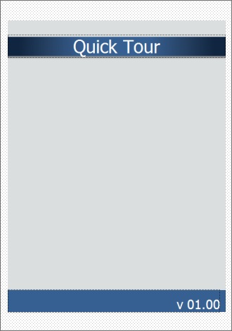
The preview box (to the left) displays the changes made in the "Background", "Header" and "Footer" sections.
If required, you can use drag-and-drop to move the "Header" and "Footer" areas upwards and downwards and/or resize them - drag the area's  into the intended position.
Click  to apply the modifications OR proceed to another tab.
 to customize a color.
 to browse your PC for an image.