|
Adding a Video Player Control to a Screen |
  
|
Adding a Video Player Control to a Screen
|
Adding a Video Player Control to a Screen |
|
Control Purpose
This control is used to play local or online videos on the device's screen, meaning, you can play videos that are sourced in the device's folders or use a URL to access cloud-based videos. It also includes several video player controls such as Start or Pause so the operator can have some control over the video viewing. Check the examples at the end of the topic.
This control supports these video file types - "3GP" (= ".3gp"), "mp4" (= ".mp4"), "mkv" (= ".mkv"), "mpegts" (= ".ts"), "webm" (= ".webm") and "avi" (= ".avi").
Currently, the Video Player control can ONLY be applied to Android target devices with an installed MCL-Client v 4.10.50 or higher.
This control CANNOT display web pages. Its purpose is ONLY to play videos that are online or locally sourced.
Drag the Video Player control  from the top section of the "Control" tab onto the screen.
At this stage, there is still no video file associated to this control.
Step-by-step
1. Drag the control onto the screen.
2. Now, double-click the selected control on the screen OR the representation in the tree view to open the properties window.
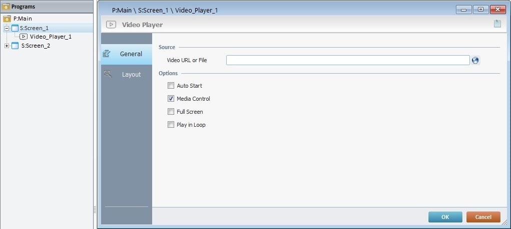
The "General" tab is open by default.
3. In the "Source" section, define the path to the video you want displayed within this control:
•If the video is online, enter the video's URL.
Ex: http://files.mcl4e.com/help/designer/videos/video1.mp4
https://www.learningcontainer.com/wp-content/uploads/2020/05/sample-mp4-file.mp4
•If required, click  to access the "URL Assistant" and define the intended URL. See Detail of URL Assistant.
•If the video is placed locally, in a device's folder, enter the path to the file.
Ex: files\apps\<running application>\res\<video name>
•As an alternative, you can use a variable with the intended URL or folder path - right-click this box, click the "Variable Select" option and select the variable with that value.
If you want to use a video that has been imported into the "Resources" module, use one of the following methods:
•Drag the video from the "Resources" module and drop it into the source related box.
•Right-click the source related box, click "Resource Select" and, then, select one of the available videos in the resulting window.
If you want to use videos that have been imported into the project without opening the control's properties window, you can drag the intended video from the "Resources" module onto the control displayed on the screen (in this case, the video source related option is, automatically, filled in with the name of the dropped video).
ONLY the "*.3gp", "*.mp4", "*.mkv", "*.ts", "*.webm" and "*.avi" file extensions are supported.
4. In the "Options" section, check the features/options you want the control to have:
Auto Start |
Check this option to automatically start the video as soon as the screen containing the Video Player is drawn. |
Media Control |
When checked, this option enables the available player controls such as "Start", "Pause" "Jump Forward/Backward". This means the operator will be able to control the video viewing.
|
Full Screen |
Checking this option means the display area of the video will, automatically, expand to full screen once the operator presses PLAY. Checking "Full Screen" automatically enables the "Media Control" option - this allows the operator to control the viewing and/or exit "Full Screen", if he wants to. |
Play in Loop |
Check this option if you want the defined video to play in a continuous loop. |
5. Go to the "Layout" tab.
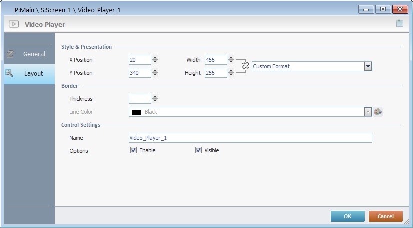
6. Define the control's style:
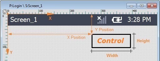
X Position |
Maintain the given values or specify the control's position within the screen, by providing the "X" and "Y" coordinates. Use the attached arrows OR fill in the values manually. |
Y Position |
|
Width |
Define the control's width and height. Use the attached arrows OR fill in the values manually. Both values are linked to the format you select from the drop-down ("Format 4:3", "Format 16:9", "Format 1:1"), meaning, once you select a format for the control and you change one of the values, the other value will automatically adapt to conform with the selected format.
If you want full control of the width and height values, without format conformity, select "Custom Format" from the drop-down and fill in both boxes as required. |
Height |
Detail of Position/Size values
7. In the "Border" section, define the control's borders:
Thickness |
Define the thickness of the control's border line. Use the attached arrows OR enter the value manually. If the option is kept empty, there will be no visible borders to the control. |
Line Color |
This option ONLY becomes active after you have defined a value for the border's thickness. Define the border line's color. Maintain the default "black" OR click |
8. In the "Control Settings" section, attribute a name to the control. This name is displayed in the tree view.
9. Check the "Enable" option to activate the feature(s) you selected in the "General" tab.
10. Check the "Visible" option to ensure the control is displayed on the device's screen.
11. If required, use the  icon (located on the upper right corner of the properties window) to attach any relevant notes to this control. Enter your text in the resulting window. This information is displayed in the "Developer report". See Report.
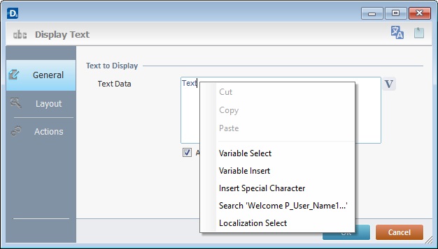
Use the right-click in MCL-Designer's input boxes to access some related options as well as the general "Cut"; "Copy"; "Paste"; "Search"actions (active/inactive according to the current context).
Ex: If you right-click the "Text Data" input box (included in a "Display Text" properties window), you are provided with the general editing/search actions and other specific options such as "Variable Select" (see "Variable Select") ;"Variable Insert" (see "Variable Insert"), "Insert Special Character" (see To Insert Special Characters into a Control's Text Input Field) and "Localization Select" (see Localization List).
If you right-click any other input box, it may provide other possibilities.
12. Click  to apply the editing choices.
The "Video Player" control has been successfully added to the screen.
If any subsequent edition of the control's properties is required, double-click the Video Player in the tree view OR right-click it and select "Edit" to open the properties window.
|
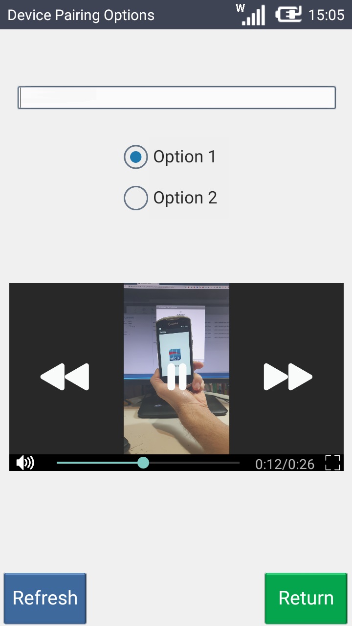
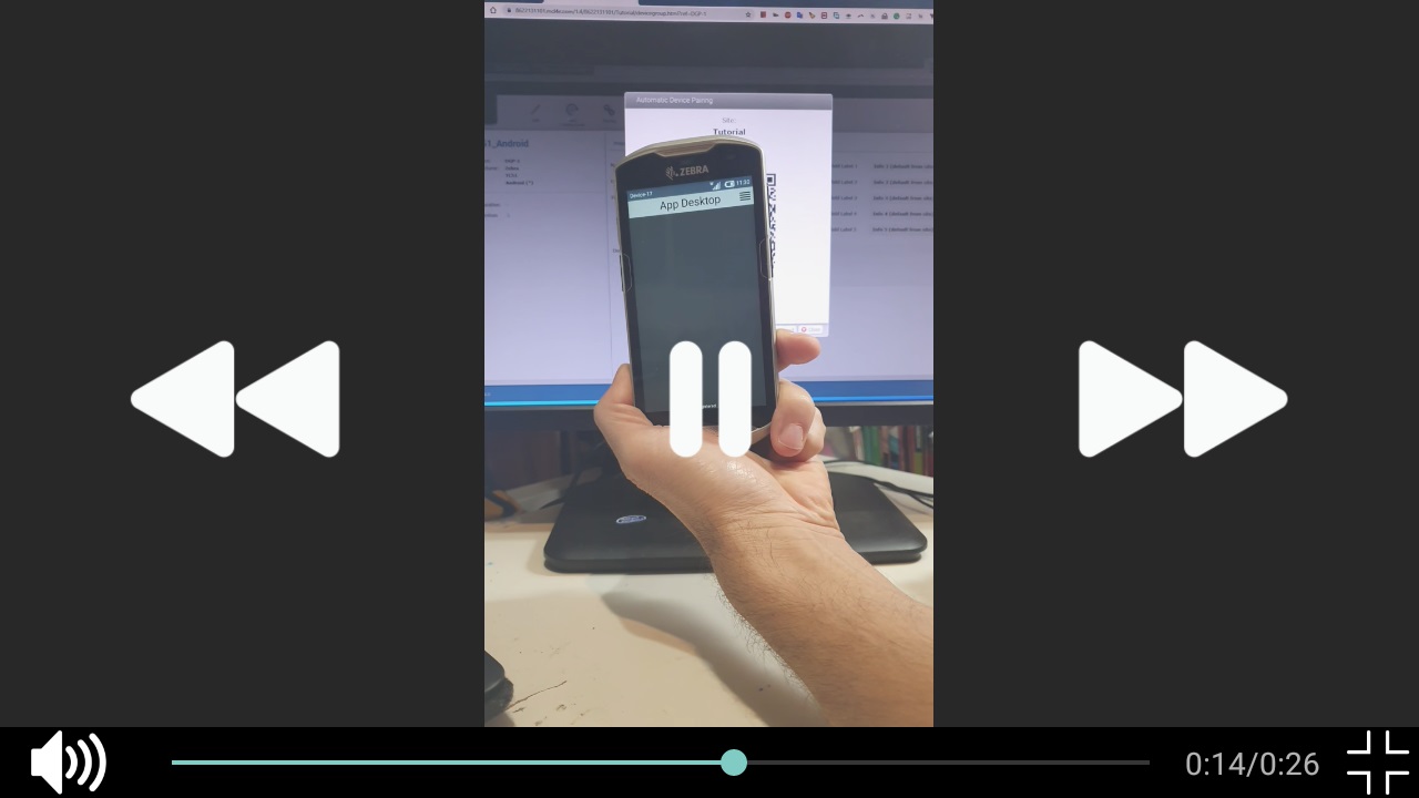
1. The screen includes several controls one of which is a Video Player. It is running a video and the video viewing is restricted to the Video Player's defined area. |
|
2. The Video Player now displays options to allow the operator to control the video viewing and have time info. For instance, the video is playing so there is access to the "Pause", "Move Forward", "Sound", etc. The slider and time stamp provide video duration and time elapsed. These options are enabled if the "Media Control" option in the "General" tab is checked and are activated when the operator touches the Video Player area on the device's screen. |
|
3. If you check the option"Full Screen" (in the "General" tab), once the video starts playing in the device, it expands to cover the screen's whole area. |
|
4. Once the video being played is in "Full Screen" mode, the operator can touch the screen to activate the "Media Control" and access all its options, even return the video display to its original size, meaning, the defined size for the Video Player control. |