|
Adding Controls to a Screen |
  
|
Adding Controls to a Screen
|
Adding Controls to a Screen |
|
Overview
Adding controls to a screen involves selecting the appropriate control, dragging it onto a screen but also setting up that control's features.
To Add Controls to a Screen
Go to the "Control" tab (it is usually open and the "Process" tab is collapsed):
|
Drag controls from this section of the "Control" tab onto the screen. This control can be edited after it is dropped onto the screen. Double-click the control to open its properties window and select/fill in the available options accordingly.
To have a more specific control style, select a control and, then, a standard style from the Style Preview section. |
The Style Preview section displays various standard and created style options for the control selected in the section above.
Use the Drag-and-Drop mechanism to select a specific standard style.
You can view and duplicate the properties of these specific styles. Right-click any style and, in the resulting menu, select the appropriate option for your requirements. |
Drag-and-Drop Mechanism
The adding process in MCL-Designer V4 is based on the standard Windows Drag-and Drop mechanism. Simply select an item on the “Control” tab OR the Style Preview section and drag-and-drop it to a target location.
The Drag-and-Drop capability is optimized by the use of the Grid tool.
The positioning can be refined by using the different MCL-Designer V4 alignment tools, located in the Icon Shortcut Bar, or by using coordinates (in the "Layout" tab of the control's properties window).
Grid Tool
When activated, the Grid is displayed on the screen(s) and helps the positioning of the added control.
Grids can be magnetic. This means that controls will automatically snap into place along the Grid lines. See Grid Section.
Remember that the Grid is beneath every control.
To Add Controls
Step-by-Step
1. Open the screen to be edited by double-clicking its representation, in the tree view.
2. Click the specific control, from the “Control” tab.
3. Drag the selected control onto the screen in the Working Area.
4. Drop the control to a specific position.
5.To access the newly added control's properties, double-click it OR right-click it to open the menu and select the “… Properties” option.
 For detailed instructions on how to fill in the different property options, see the topic corresponding to the selected control.
6. To apply the configuration options, click  .
.
The Control's Right-Click Menu
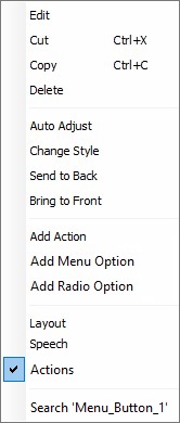
Once a control has been added to a screen, you can right-click it to open a menu with a number of options. The available options will depend on the selected control:
|
Edit |
Opens the selected control's properties window so you can edit it. |
Cut |
Removes the selected control from the screen. If you want to undo this action, use the screen's "Paste" option (in its right-click menu). |
|
Copy |
Copies the selected control. Complete the operation with the "Paste" or the "Paste without Actions" option that is provided by the screen's right-click menu. |
|
Delete |
Deletes the selected control. |
|
Auto Adjust |
Only available for some controls. Adjusts the selected control's size to the space being used by the control's defined text. |
|
Change Style |
Opens a "Select a Style" window which displays the control's standard styles and provides options regarding them. See Editing and Creating Styles. |
|
Send to Back |
Sends the selected control to the background of another control.
As an alternative, you can manage the control overlap order in the tree view (by drag-and-dropping the intended control(s) within the tree view). |
|
Bring to Front |
Brings the selected control to the foreground of another control.
As an alternative, you can manage the control overlap order in the tree view (by drag-and-dropping the intended control(s) within the tree view). |
|
Add Action |
Allows you to add a compatible action to the selected control. See Actions Associated to Controls. Click this option and select the intended action in the resulting window. The selected control's "Actions" tab opens and you can add the required processes to the new action. Conclude by clicking |
|
Add Menu Option |
Only available in the Menu Button and Menu Text controls. Adds a new button/item to the control. |
|
Add Radio Option |
Only available in the Radio Button control. Adds a new option to the control. |
|
This section provides direct access to certain tabs of the selected control's properties window. In this case, the selected control is a Radio Button with an enabled speech feature so the available options are "Layout", "Speech" and "Actions". |
||
Search 'xxx' |
Opens the "Search" window. See Detail of Search.
|
|
Control Dimensions
Instead of defining the control's dimensions in the "Layout" tab (in the control's properties window), use the mouse to re-dimension the control within the screen.
Select the control and use the blue dots to expand or shrink it.
The Control's Visual Information
If you mouse over a control in the screen, you are provided with information about that control. The available information depends on the control.
Ex: The information available on a Menu Button control:
|
Possible Info |
|
Name |
The control's name. |
|
Cols/Lines |
The control's number of columns/rows. |
|
Def. Pos. |
The control's active default position. |
|
Variable |
The control's assigned variable. |
|
Go to |
The control's action. |
|
File |
The control's assigned file. |
|
Style |
The control's style. |
|
(X, Y, W, H) |
The control's position on screen (X, Y coordinates) and dimensions (W (Width), H (Height)). |
|
|
This icon is displayed if the control has more than one associated action. |
|
The Display of a Control's Image Element
Some of the MCL-Designer V4 controls include an image element (ex: Button; SoftKey; Menu Button, Display Image). It is possible to rotate and/or flip that image element.
This advanced feature is accessed via the right-click menu of the control's corresponding "Image" or “File” box or the "Icon" column.
Step-by-step
1. Open the properties window of the control that includes an image element.
2. You can select an image by clicking  and browsing for one or you can define it later, in the "Advanced Image Settings" window.
3. Right-click the "Image" (or "File") box.
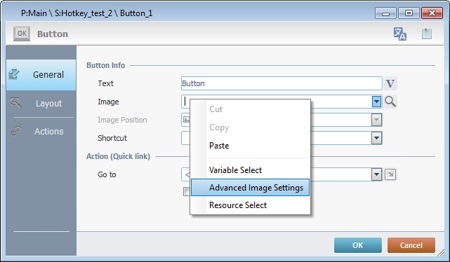
Ex: A Button control.
4. Click "Advanced Image Settings" in the resulting menu.

Ex: There is no prior image selected.
The "Advanced Image Settings" window that originates in the Menu Button control's properties window (a right-click in the "Icon" column) is slightly different. This is due to the fact that the Menu Button's elements (buttons) have a selected and unselected state. This means you can define one image per state.

5. If you do not have a selected image resource already, click to browse for it.
If the image was previously defined in the control's properties window, continue to step 6.
If you are dealing with a "Menu Button", define an image for each state by clicking the corresponding .
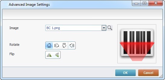
6. Use the available "Rotate" and "Flip" buttons to change the image element's display:
•90°/180°/270° rotation buttons. The default button refers to the selected image's original position.
•vertical/horizontal flip buttons.

In the "Advanced Image Settings" window of a "Menu Button", the selected rotation/flip buttons affect both the "Not Selected" and "Selected" images.

It is possible to combine one of the "Rotate" buttons to one or both of the "Flip" options.
The preview box to the right displays all the selected changes.
In the case of the Menu Button, even though both images adopt your rotation/flip choices, the preview box only displays the "Not Selected" image with the changes.
7. Click to apply.
Controls in the Tree View
The controls contained within a screen are displayed in the tree view of the "Programs" module.
The tree view allows you to access the selected control's properties window and to manage the overlap order of the controls within the screen. In other words, you can use the tree view to edit each control and define which control is brought to the front and which control or controls are sent to the back.
Overlap Order of the Controls within a Screen
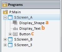
As the controls are being added to the screen they are also being added to the tree view. The display order in the tree view reflects their position in relation to each other within the screen, meaning, which control is positioned behind or in front of another control.
The control that appears first in the tree view is drawn first in the screen, then, the second control displayed in the tree view is drawn and so forth. This means that the control displayed last in the tree view is the control brought to the front in the screen (because it is drawn last), the first control is sent to the back of all the other controls (since it was the first control to be drawn), and so on.
If required, you can use the Drag-and-Drop to alter the overlap order in the tree view.
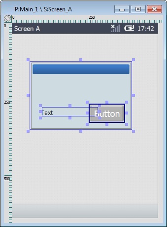
•Overlap order is as follows: Control a ("Display_Shape") is positioned behind controls b ("Display_Text") and c ("Button"). Control b ("Display_Text") is in front of control a ("Display_Shape") but behind control c ("Button"). Control c ("Button") is positioned in front of both a ("Display_Shape") and b ("Display_Text") controls.
•Use Drag-and-Drop within the tree view to rearrange the controls' order.
•Overlap order was changed into the following: Control a ("Display_Shape") is positioned in front of control b ("Display_Text") and c ("Button"). Control b ("Display_Text") is behind control a ("Display_Shape") but in front of control c ("Button"). Control c ("Button") is positioned behind of both a ("Display_Shape") and b ("Display_Text") controls.
If you want to define control overlap, there are two alternatives to the Drag-and-Drop in the tree view:
1. Right-click a control in the screen and use the "Bring to Front" and/or "Send to Back" options. 2. Select the intended control, click "Format" (in the Menu Bar) and click "Bring to Front" or "Send to Back" in the resulting menu.
Remember that these alternatives only work one control at a time.
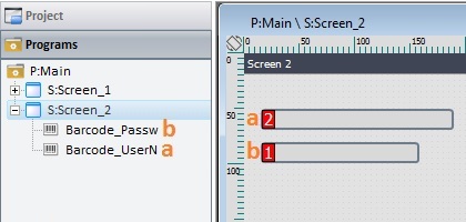
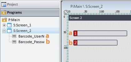
When considering Input Controls, the tree view sequence also affects the tab order (the order attributed to Input Controls for data input). In this case, the Input Control that appears first in the tree view is the first to receive entered data, then, the next Input Control in the tree view receives data and so on. If you drag an Input Control to another position within the tree view, this affects its position in the tab order. Below is an example of what happens regarding the screen's tab order when you drag-and-drop Input Controls within a tree view (the number attached to each control represents the order for the data input)
Example of Tab Order Change Via Control Drag-and-Drop in the Tree View
For more detailed information on how to define the tab order of a screen's Input Controls, see Tab Order.
|
||||||||||||||
To Insert Special Characters into a Control's Text Input Field
If required, you can add special characters (ex: "Tab", "CR", "Line Feed", "Pipe", "Backslash", etc.) to controls with text input fields. For instance, you can use this feature in a Display Text control to separate added text/variable content with pipe characters. You can insert more than one special character in a single text input field.
Use the right-click in the intended control's text input field to access the "Insert Special Character" advanced option and select the intended special character(s).
Step-by-step
1. Open the properties window of the desired control (ex. Display Text control).
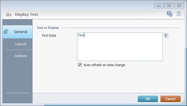
2. Right-click the control's text input field and select the "Insert Special Character" option.

The "Special Character" window opens.
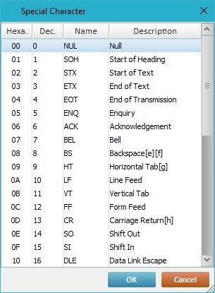
3. Select the character to insert (ex. "[LF] - Line Feed"). If needed, you can insert more than one special character, at a time.
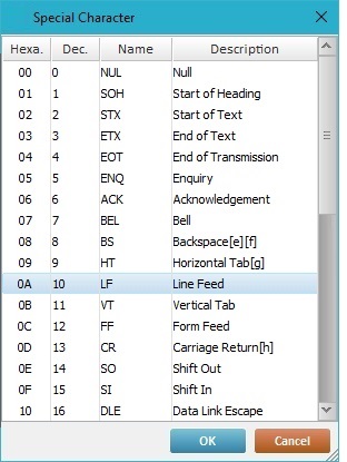
4. Click to apply. The inserted special character is displayed in the current text input box, in red.

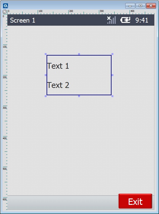
In this example, the Display Text control includes two special characters, the "[LF]" (the Line Feed) and the "[CR]" (the Carriage Return) that separate the added text "Text 1" and "Text 2". The selected special characters are displayed in red.
Below is an MCL-Simulator image that illustrates how the use of these special characters will affect the text display in the application.
|
To Combine Text and Variables into a Control's Text Input Fields
It is possible to concatenate variables and text within a control's text input field using its right-click menu "Variable Insert" option.
In a text input field, add the intended text and, wherever necessary, insert the variable that contains the required value. It is possible to combine text and variables as many times as needed, as long as the current control can contain/display the added text and the value of the added variables.
Step-by-step
1. Open the properties window of the intended control (ex. a Display Text control).
2. Enter the required text (ex. "Welcome") in the text input field and use a right-click to access/select the "Variable Insert" option.

The resulting "Variable Select" window opens displaying the available variables for concatenation.
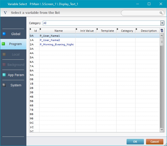
3. Double-click the variable you want to insert OR select it and click .
You can insert a variable before, after or in between the already entered text - just place the cursor in the intended position.
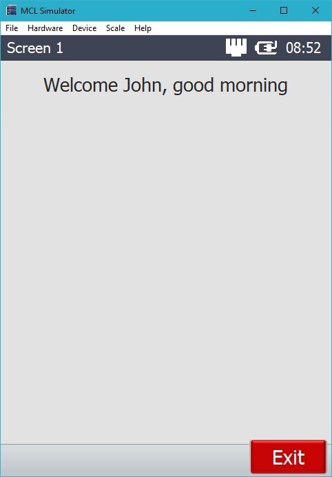
Ex: Variable content will be added after the entered text, meaning, after "Welcome ".
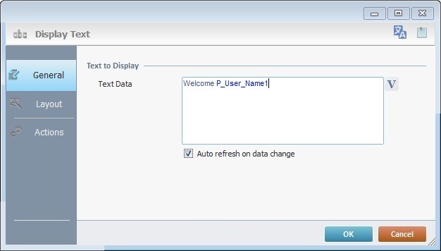
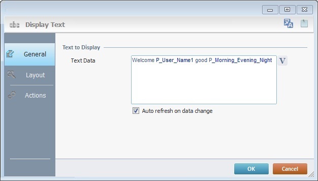
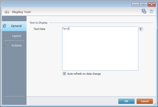
4. The added text and inserted variables are displayed in the control's text input field (ex. the "Text Data" field of the Display Text control contains the added text, "Welcome" and references the inserted variable "P_User_Name1").
If you want to add more variables in different places within the added text, make sure you set the cursor to the intended position prior to using the right-click menu.
5. Click to apply.
The added text and inserted variables are displayed in the control's text input field (ex. the "Text Data" field of the "Display Text" control contains the added texts, "Welcome" and ", good", and references the inserted variables "P_User_Name1" and "P_Morning_Evening_Night").

When using variables to provide dynamic data, we recommend you check the "Auto Refresh" option (whenever available) to ensure that the control's information is up-to-date.
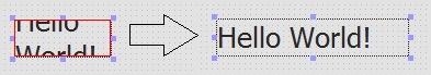
Ex: Check the "Auto refresh on data change" option of the Display Text control.
The text input field allows you to delete/edit the added text, character by character. But each inserted variable is treated as a block, it is NOT possible to edit/delete parts of the variable (ex: edit the name of the variable), it is always selected as a whole.
In this example, the Display Text control includes the added text "Welcome" followed by one variable - "P_User_Name1" (containing the first name of the logged in operator), a second text ", good" and another variable"P_Morning_Evening_Night" (which stores the value "morning", "evening" or "night" according to the hour of the day).
|
Since each control has specific features, which influence its settings, this subject-matter is addressed in the following topics:
Topic |
|---|


