|
Adding a Combo Box Control to a Screen |
  
|
Adding a Combo Box Control to a Screen
|
Adding a Combo Box Control to a Screen |
|
Control Purpose
This control is used to allow the operator to define data by selecting it from a fixed list. This fixed list of values is presented as a drop-down on the screen of the device. The data to be displayed by this control can be entered OR come from a variable ("Text/Variables") OR from values stored in a data file field ("Data File") OR a local database table field (Local Database). The selected data is stored in user variables and can, then, be further processed or stored. See Variable Definition.
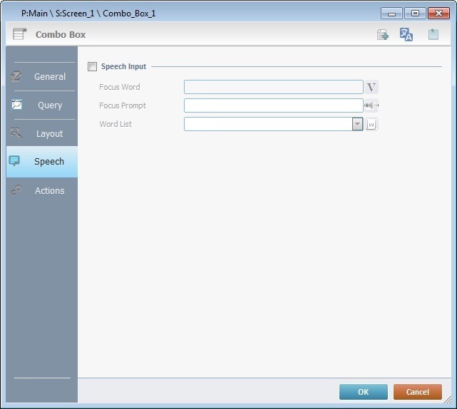
If your MCL-Designer V4 subscription includes Speech attributes, it will affect the use of the Combo Box - this control will also accept speech input (operator speaking into the device) and provide output information (instructions to be heard by the operator).
Drag this control  from the top section of the "Control" tab OR the Style Preview section onto the screen.
Step-by-Step
1. Drag the control onto the screen:
•If dragged from the "Control" tab, the control will assume the default style.
•If dragged from the Style Preview section, it will assume that particular style.
2. Now, double-click the selected control on the screen OR the tree view to open the properties window.
The "General" tab is open by default.
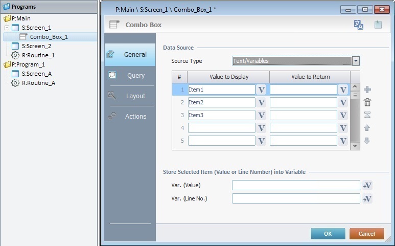
3. In the "Source Type" option, select the source of the values to be displayed in the Combo Box control ("Text/Variables", "Data File" or "Local Database").
4. Fill in the options according to the selected "Source Type".
When selecting the “Text/Variables” option (the default option), follow these instructions:
a. Value to Display column Define the name of each list item. Either enter the name of each item/button in the corresponding box OR click
b. Value to Return column Fill in this column to provide an alternative text for each list item. Enter the alternative value OR click
Use the editing icons to the right of the table to move the rows up and down and to delete or add more rows.
c. In the "Store Selected Item (Value or Line Number) into Variable" option:
I. Var. (Value) - Click
II. Var. (Line No) - Click
d. Proceed to Step 5.
|
When selecting "Data File", the corresponding options become available. Proceed as follows:
a. In the "File Name" box, select a data file from the drop-down list. If required, click
b. In the "Field to Display" drop-down, select the data file field to be displayed from the drop-down list.
c. In the "Field to Return" drop-down, define the field that contains the value to return.
d. In the "Store Selected Item (Value or Line Number) into Variable" section:
I. Var. (Value) - Click
II. Var. (Line No) - Click
e. Continue to Step 5.
|
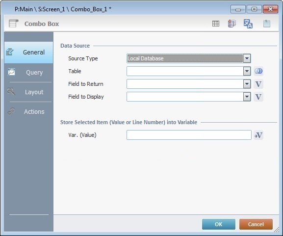
When selecting "Local Database", the corresponding options become available. Proceed as follows:
a. In the "Table" drop-down, select the required table. See How to Work with a Local Database. If needed, click
Ex: Table - "P_descending" Field to Return - "[date]"
b. In the "Field to Return" option, define the field that contains the value to return.
c. Select the field to be displayed from the drop-down.
You must enter the name of each intended field manually and always enclose it in square brackets [].
d. In the "Store Selected Item (Value or Line Number) into Variable" option:
I. Var. (Value) - Click
e. Continue to Step 5.
|
5. Go to the "Query" tab.
If the data source for this control is text/content of a variable, continue to step 8 (the "Layout" tab) because the "Query" tab will be inactive.
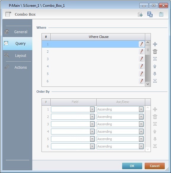
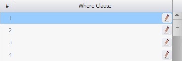
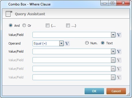
6. If the control's data source is a data file or a local database table, you can define a query using "where conditions" in the "Where Clause" table. The "Query Assistant" will help you define the criteria for the necessary "Where" clause(s) (fields, operand, value type).
Use the editing icons to the right of the table to move the rows up and down and to delete or add more rows.
1. Double-click the required row OR click the corresponding
2. Fill in the resulting window as follows:
3. Click |
If the query is not needed and the control's data source is a Data File, continue to the "Layout" tab (step 8) - the next table in the "Query" tab ("Order by") is NOT active for this source type.
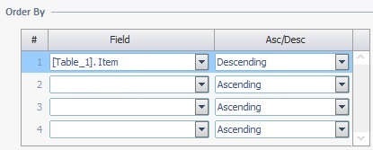
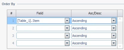
7. If the data source for this control is a Local Database, the "Order By" table will be available to sort the order of the defined table fields.
If you require the sorting of the displayed data into an ascending or descending order, select the intended field(s) and the intended order in the corresponding drop-down.
If no sorting is necessary, proceed to the "Layout" tab (step 8).

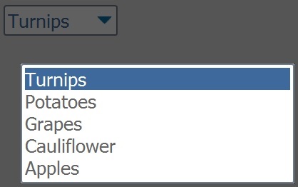
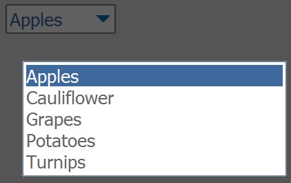
When defining the fields to be sorted and their order (ascending or descending), think of it as a sorting hierarchy, meaning, the MCL application will sort the data of the first field as expected, the second field's sorting order will base itself on the sorting of the first field and so on. The simultaneous sorting of several fields is useful if the there are fields with duplicate entries (ex: a "date" field with many same day entries).
Table Content:
Example 1
Example 2
|
8. Go to the "Layout" tab.
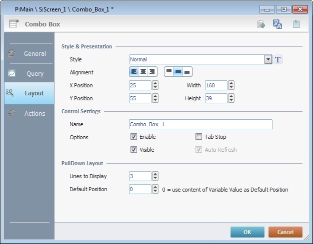
9. Define the control's style by selecting an option from the drop-down OR by clicking  . See Editing and Creating Styles and Editing and Creating the Combo Box Style.
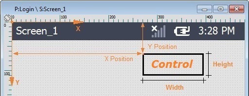
10. Position the values, within each button, with the alignment buttons.
11. Maintain the given values or specify the control's position/size within the screen, by providing the "X" and "Y" coordinates as well as "Width" and "Height".
Detail of Position/Size values
12. In the "Control Settings", attribute a name to the control. This name is displayed in the tree view.
13. Consider whether or not to check the following options:
"Enable"
Activates the control's input feature.
"Tab Stop"
Must be checked to enable a "Change Tab Order". This provides the possibility to change the order (between data input controls) in which the information is keyed in by the operator.
"Visible"
Manages the control's visibility in the device's screen.
14. Define the "PullDown Layout":
"Lines to Display "
Select the amount of lines/rows that will appear on the device's screen when the Combo Box control is expanded.
"Default Position"
Select the row that will appear when the Combo Box control is collapsed.
 In case of navigation between this program and other programs, enter "0" to ensure that the default position is the row you have selected. This is the expected behavior:
I. The screen with the Combo Box is executed and the control's default position is the first row (value "1").
II. The operator selects a different row within the Combo Box, for instance, row 3.
III. The operator or the application workflow calls another program and, then, returns to the same program/screen with the Combo Box.
IV. The control's default position is the previously selected row - row 3.
In other words, the value for the control's default position was retrieved from a default local variable that stored the selected row's position (value "3").
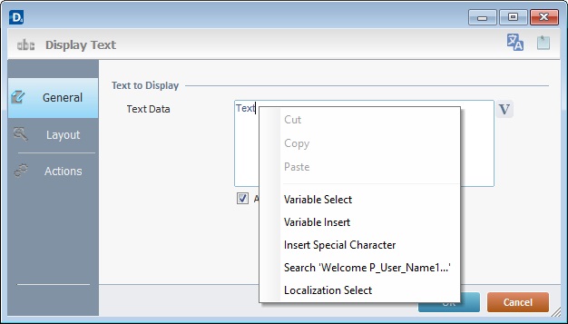
Use the right-click in MCL-Designer's input boxes to access some related options as well as the general "Cut"; "Copy"; "Paste"; "Search"actions (active/inactive according to the current context).
Ex: If you right-click the "Text Data" input box (included in a Display Text properties window), you are provided with the general editing/search actions and other specific options such as "Variable Select" (see "Variable Select"),"Variable Insert" (see "Variable Insert"), "Insert Special Character" (see To Insert Special Characters into a Control's Text Input Field) and "Localization Select" (see Localization List).
If you right-click any other input box, it may provide other possibilities.
Speech Feature If your MCL-Designer V4 subscription includes Speech attributes, you will have access to an extra tab - "Speech"- where you can define this control's speech possibilities.
All speech related options within this control are explained in another topic - see Speech in the Combo Box Control. Once you have gone through the topic, use the provided link to return to this step-by-step and continue to the "Actions" tab.
If your MCL-Designer V4 license does NOT have Speech attributes, the next tab is the "Actions" tab. Continue to step 15. |
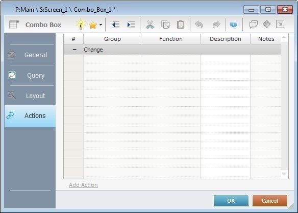
Default action: "Change" - Is triggered when the operator selects a Combo Box option.
Keep in mind that there is always a default action (ex: "Change"; "Timer"; "Hotkey"; etc.) attached to the control (in this case, a "Change" action). If you want the action to trigger something, you must add processes to it (ex: "Go To"; "Check File"; "Set Focus"; etc.).
16. If required, double-click the empty line below the action OR click  in the editing bar to add a process to the action. See Adding Processes to a Screen or a Control.
This control has predefined Local Variables (only available in "action" context). See Combo Box's Predefined Local Variables.
Before concluding the addition operation, check the following:
Remember that the "Enable" option (located in the "Layout" tab) must be checked so that the added actions/processes run.
17. If required, use the icons located on the upper right corner of the properties window:
 Click this icon to create a new data file. Go to Creating a Data File to see how to fill in the several options available.
It is only available if you select a data file as a data source.
Click this icon to create a new local database table. Check Creating a Table to see how to fill in the several options available.
It is only available if you select a local database as a data source.
Click it to view/edit the content of the table that was selected as a data source. See Viewing/Editing Table Data.
This icon is only available if the control's data source is a local database table.
Click this icon to open a "Localization" window where you can edit the text element within that control or add translations to it. See Localization.
Click this icon to attach any relevant notes to this control. Enter your text in the resulting window. This information is displayed in the "Developer report". See Report.
18. Click  in the "Actions" tab to apply the choices made.
The Combo Box control has been successfully added to the screen.

If any subsequent edition of the control's properties is required, double-click the Combo Box OR select "Edit" (in its right-click menu) to open the properties window.
If you want to view this control applied within an application, see Sample Applications.
Combo Box's Predefined Local Variables
This control has predefined Local variables (only available in "action" context).
Action |
Change |
||
Variable Name |
L_Control_Name |
L_Field_Value |
L_Line_Number |
Variable ID |
&0a |
&1a |
&2a |
Description |
Stores the control's name (*) |
Stores selected field value (**) |
Stores selected field number |
* Defined in the control's properties window ("Layout" tab).
** Defined in the control's properties window ("General" tab).
 and select a variable with the intended value. See
  to select the variable that will receive the selected item value. See
 to open the "Join Tables" window. See
 .
.